In this article we look at being more aware of different types of disability and understanding the specific barriers that disabled people face when using social media.
Happy Disability Pride Month folks!
In solidarity, pride and acceptance of disabled people, we’re celebrating Disability Pride Month this July by sharing 7 top tips to make your social media posts more accessible.
Let’s rebel against barriers
Disability is a natural part of human diversity, yet disabled people often suffer from a lack of understanding from those who are not disabled.
Many of us have a long-term illness, an impairment or a disability. Some of us are living with a permanent condition, and even more of us have a temporary condition, like a broken limb.
What in our environment and our attitudes hinders disabled people from contributing to society to their full capacity? Here, we look at improving our social media to make it more readily understandable.
How to make social media accessible
At East Sussex County Council we use social media a lot to communicate with our residents. We are learning how to make this as inclusive as we can.
Here are some of the barriers we found on our social media that prevent disabled people from accessing it:
- hashtags written inaccessibly
- important information given only in the image and not in the body text of the post
- images with a lot of text in them
- posts with images but no accompanying text in the body of the post
- images with no alt text
- images with poor colour contrast
- videos with no closed captions
- using too many emojis.
We’ll address each of those issues below.
7 guidelines to make social media posts more accessible
1. Hashtags
- Don’t use all capital letters.
- Use capital letters at the start of each word in the hashtag. For example, #AccessibilityAwareness instead of #accessibilityawareness so screen readers can interpret them more easily.
- That will help you avoid unintended meanings, like this classic hashtag disaster, #Susanalbumparty, which caused much mirth and hastily got changed to #SusanBoylesAlbumParty.
2. Text
Key information must be included in body text – not locked in the image.
If the information is available on a website (and especially if that might be subject to change) then add a link to that web page.
- Facebook and Instagram: You have plenty of space in your Facebook post to provide a lot of text information. Structure it so that the important information is near the top of the post so it will be seen before the ‘See more’ link.
- Twitter: If your message is more than 280 characters, then turn it into a thread. To create a thread, start by creating the first Tweet then reply to your own Tweet. You can reply to the first Tweet a few times if you need to make a long thread.
3. Images – don’t use images with lots of text
While it’s tempting to throw important information onto your images, your posts will have little engagement and you risk alienating users who are turned off by the busy copy:
- use little to no text in your image
- if you need to include text in your image, use few words
- instead of adding a lot of text to your image, add it directly into the body text
- images with less than 20% text perform better
- generally, don’t add a URL in the text on an image – you can’t expect users to copy them out – URLs belong in the body of the post where they are clickable.
- And don’t post an image on its own, without accompanying text in the post.

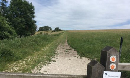
This image uses just a few words. The key information would be in the body of the post, not the image.
4. Images – alt text
- Alt text (alternative text) doesn’t appear anywhere on your posts. It gives screen readers something to read aloud to users with visual impairments.
- Alt text is not supported with animated GIFs or videos.
- Most social media tools have options to add alt text.
How to write good alt text:
- don’t include ‘image of’, ‘photo of’, ‘graphic of’ or ‘picture of’ (screen readers automatically announce an image as an image, so an alt text “Image of an apple” would be read aloud by a screen reader as “image, Image of an apple”)
- capitalise the first letter and end whole sentences with a full stop – use normal punctuation, like commas, so the text is easy to read and understand
- keep the alt text description short and specific
- your image should not have lots of text
- but if there’s brief text in your image, include it in the alt text
- alt text should not repeat the details that are in the body of the post (screen readers will read that too, so it’s just repetitive for the user and can in fact obscure the meaning if it gets lost in the duplication)
- do not use URLs in alt text
- avoid abbreviations
- describe the information conveyed, not all the details of what the picture looks like. For example, the correct alt text for the image below is ‘Choose East Sussex.’ (not what it looks like – ‘White text on round pink sticker reads Choose East Sussex’ would be incorrect.)
Correct alt text for this image: Choose East Sussex
5. Colours
- Do check the colour contrast of any text in an image that’s on a coloured background – if the contrast is too low, it will be difficult for many people to read.
- For example, if you use a pale colour for your text, then make sure the back ground is dark enough for the text to stand out well. Problems usually arise if you choose to put text on a photo that has lots of elements in it.
- Below is an example of text in an image that is hard to read, because the colour contrast between the yellow font and the white background is not high enough.
Low colour contrast makes this text hard to read
- Scroll down to find tools for checking colour contrast
6. Videos – add captions for reels and video posts
- When you add a video to your post, you need to add closed captions (CC). These are the ones that screen readers can ‘read’. The user can turn them on or off, unlike subtitles that are ‘burnt’ into a video (which are inaccessible to screen readers).
- Many social media platforms offer accessibility settings for adding closed captions.
- Ideally you should add closed captions and a voiceover.
- Adding CCs is a requirement for accessibility and is helpful for anyone who wants the sound off when they play videos.
- Examples of when a user might want read captions instead of having sound:
- when they are in a noisy environment and cannot hear the video
- situations when the sound might annoy other people such as a crowded train, library, or shared office space.
7. Emojis
- Emojis have their own alt text, so you don’t need to worry about that.
- But screen reader users will hear the alt text read out for every emoji used, so don’t use too many, and don’t place them within a sentance as having the alt text read out will disrupt the flow.
- For accessibility, emojis are best placed at the beginning or end of a sentance.
Key takeaways
We all have a part to play in order for the world of social media to be inclusive.
Accessible content reaches the widest possible audience and includes people with physical and cognitive impairments.
Why is all this important?
In the UK, 1 in 5 people are disabled, and up to 80% of the conditions are non-visible. So the chances are that you know at least one person living with a non-visible disability, whether you are aware or not.
Those who benefit from us making your content accessible include those with low vision, people who are D/deaf and hard of hearing, people with dyslexia, mental health problems and/or motor disabilities, users on the autistic spectrum and users of screen readers.
Removing barriers in the ways described above means that everyone can easily access and understand your social media… which is what you want, right?
Let’s celebrate Disability Pride Month together by seeing if we can be a bit more inclusive with our social media posts and make sure everyone, including disabled people, can enjoy them.
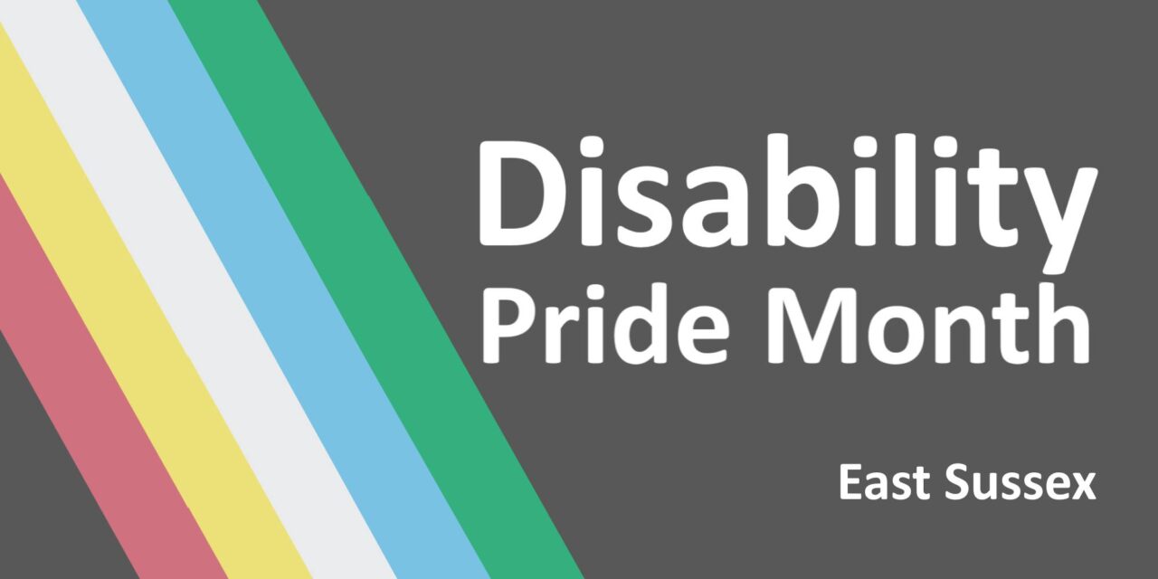
Disability Pride Flag
In the image at the top of this page, I used the colours from the Disability Pride Flag. The flag was created by Ann Magill, a disabled woman. The flag is symbolic of many experiences of the disabled community:
- the charcoal black background represents mourning for disabled people who have lost their lives due to illness, negligence, suicide and selecting who is deemed fit to reproduce or live
- the five colours each represent a different aspect of disability or impairment: red represents physical disabilities, yellow is for cognitive and intellectual disabilities, white represents nonvisible and undiagnosed disabilities, blue represents those with a mental illness, and green is for sensory perception disabilities
- the band of parallel stripes represent the barriers disabled people must overcome.
The original design had a zig-zag of bright colours but after feedback from people with visually triggering disabilities, the flag was changed to have muted colours and straight diagonal stripes.
The dark background is also a reference to the Jolly Roger pirate flag, a symbol of fearless rebellion!
Social media from East Sussex County Council
This guide is brought to you by a member of the Digital Team at East Sussex County Council.
We try to make all our social media posts accessible and provide training for each of the service teams who manage our many Facebook Pages, Twitter accounts, Instagram accounts and LinkedIn Pages on social media.
See a list of all social media sites by East Sussex County Council.
Follow Your East Sussex on social media: YES – on Instagram
Techy tools for checking colour contrast
If want to check your colour contrast, you first need to obtain the hex codes of the font and background colours:
- there are many free online colour picker tools that make it very easy to get the hex codes, like Redketchup
- or use image editing software: Paint.net is a free one, then use the Colour Picker from the Tool dropdown to get the hex codes
- then enter the hex codes in Contrast Checker – WebAIM
Feedback
If you’re still stuck and are unsure how to make your social media post accessible, leave a comment below and we’ll see if we can help.
If you are disabled, please leave a comment below to tell us what you’d most like to see improved on social media to make it accessible. And would you like to be part of a user panel to help us improve our social media and our web content to make it more accessible? If so, please Email Us we’ll be in touch.